SSMD – Smart select medical doctor
Aggregating data on doctors and providers, and giving that data back to patients, so they can make informed decisions.
Thesis:
A Platform for patients to find a doctor, who is the best choice for them.
SSMD is a platform that gives people the information they want to know, and I would argue are entitled to know, concerning finding a doctor right for them, like do they have a history of success, are patients comfortable with them, and feel that they actually care?
It is built by Alight and Consumer Medical, where I was on a team of developers, designers, scientists, health experts, and product managers located around the United States, from Boston to Pennsylvania, from Minnesota to Chicago.
My role remotely was in creating Product Design solutions for this system, providing multiple different solutions to user stories, and working with other Product Testers to see which designs would be the best implemented into production.
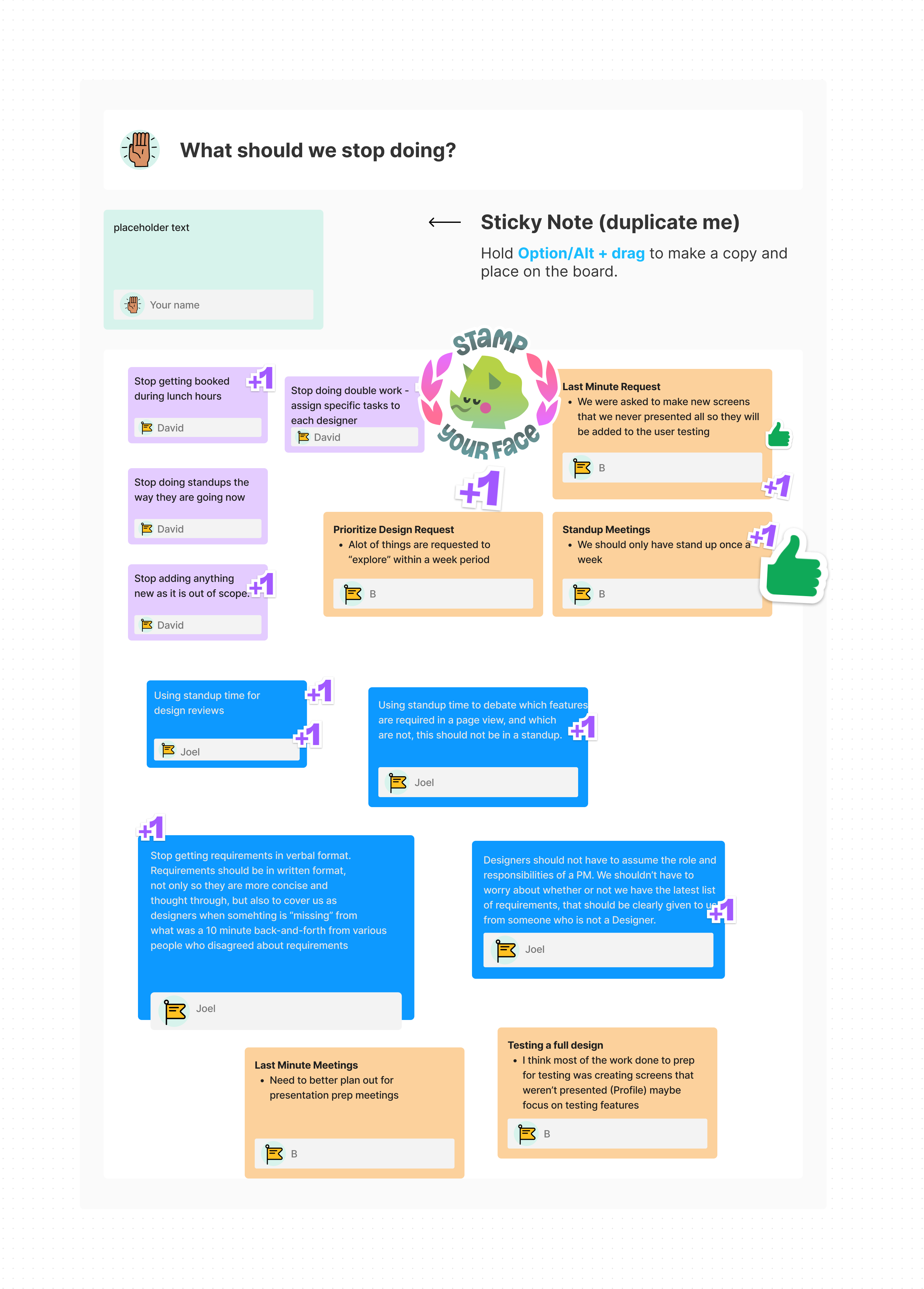
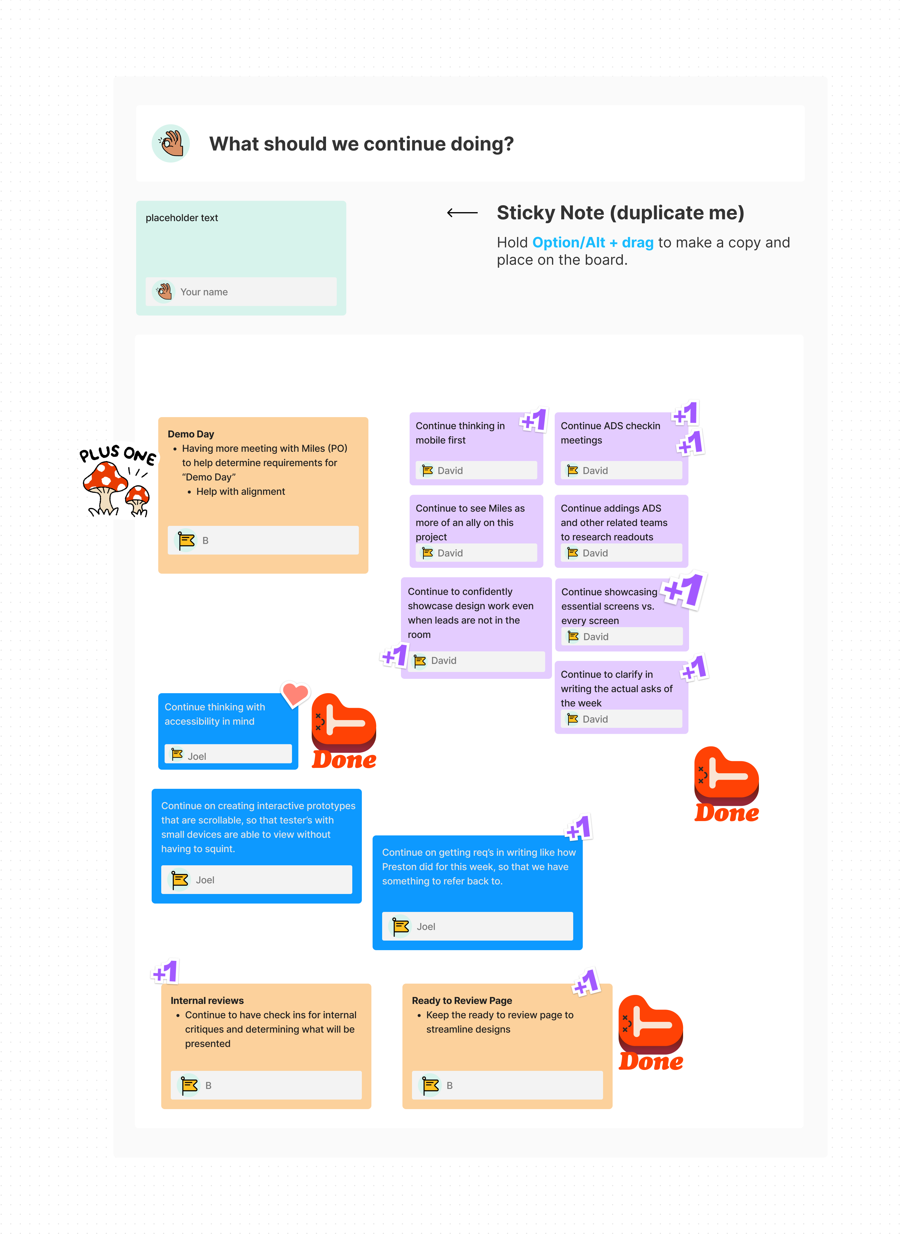
A look into how we managed
ourselves on this project
Keeping cognisant of how we are working together, what we should start doing,
what we should stop doing, and what we should continue doing.
Target and Challenge
The audience intended for SSMD, is anyone who gets healthcare as part of benefits from their employer, or their spouse/family member who gets healthcare benefits on that plan.
The scope of this project included the entire user flow, from the need of getting another doctor: what search fields should initially display? To see a list of doctors: what criteria and data would users want to see from this overview? To compare with other doctors: what data is most important and should be highlighted for users to compare? Finally, select that doctor and the facility that they work at: if the doctor works at multiple facilities, which one is best for them? Should it be based on cost, distance, and quality of care?
Problems solved
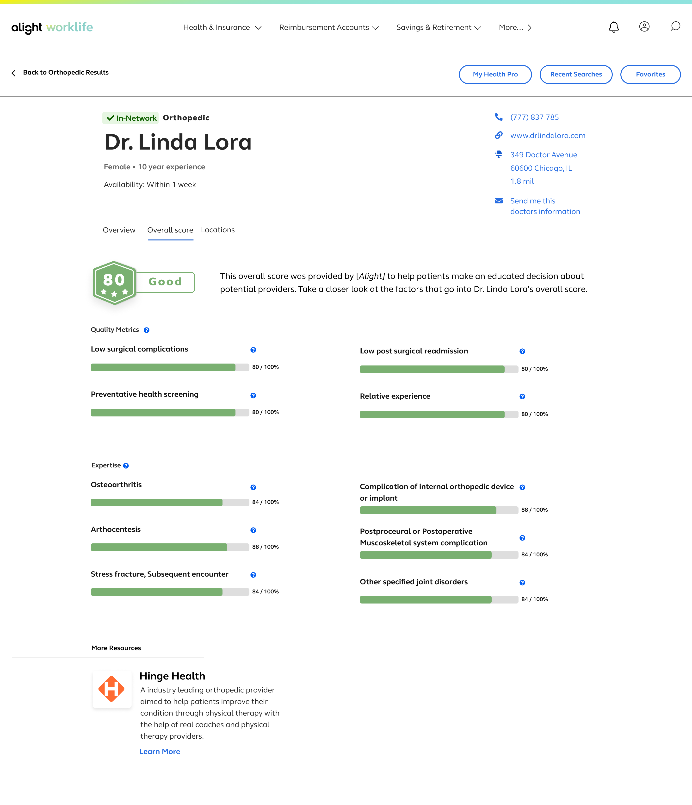
One of the most important findings we got was on the search results page, users were most interested in 3 data points about a doctor: Availability, Distance, and Overall Score. “Overall Score” were put into Elite, Excellent, and Good representing Top 20, 30, and 40 percentiles amongst the highest quality providers. All are highly recommended for the best possible outcome and patient experience.
Users were also able to view a compare doctors page, which received excellent feedback from most users. Compare Locations, as well as a Doctor Detail view. These worked together to build users’ trust in the platform.
Outcomes and Achievements
Over 90% of users tested were able to perform a search successfully and find what they needed, whether for a primary care doctor or a Specialist.
The UX/UI Design, from lo-fi prototyping, to conceptual explorations, to working with design systems internal to Alight and Smart Select Medical Doctor.
Users can:
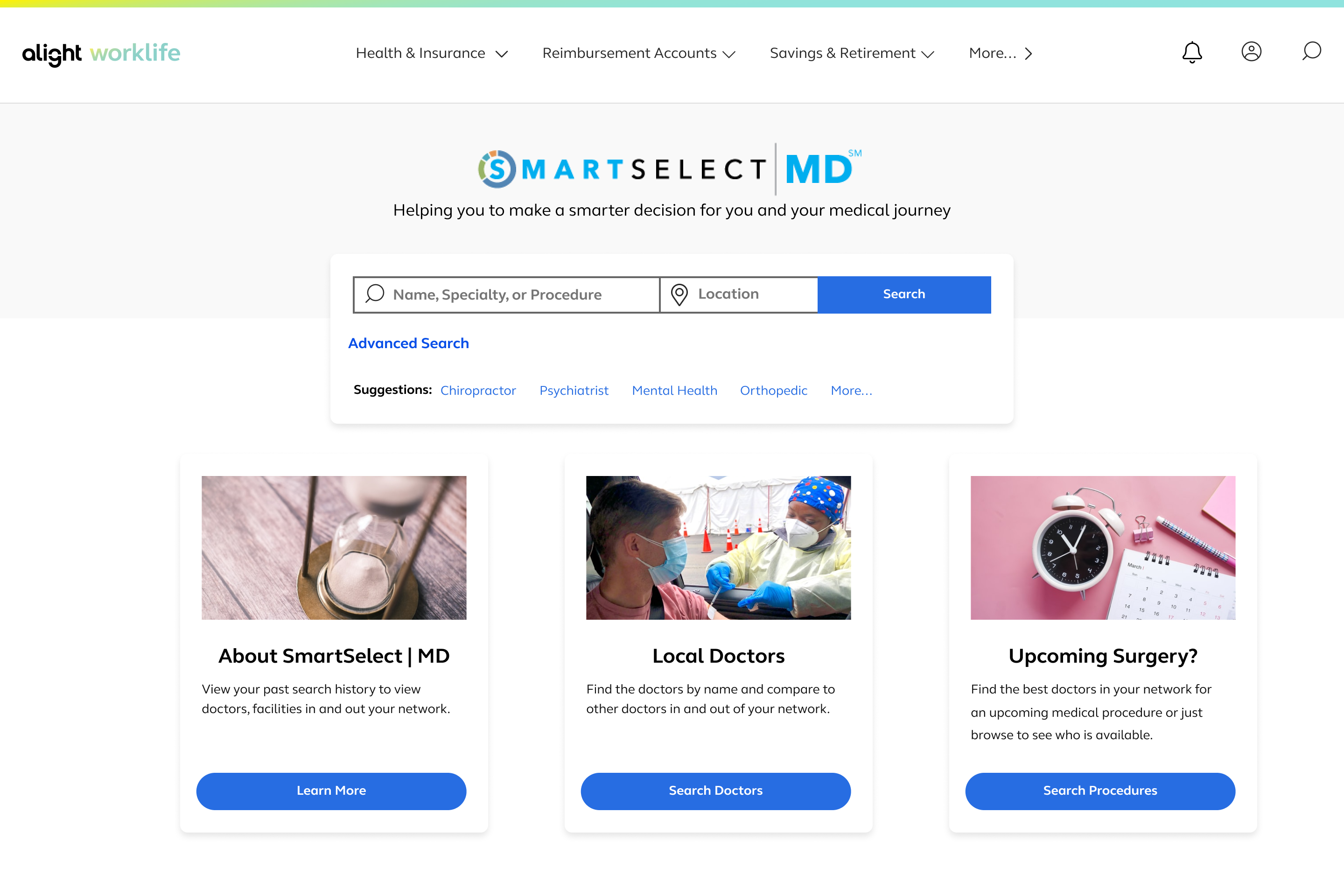
- learn how SSMD works
- begin a search for a new doctor, specialty, or procedure, based on your location
- see a list of doctors returned in the search results
- see more details about the doctor
- compare one doctor with other doctors
- contact the doctor’s office/workplace at any time through this process
The Product
Technologies used
Figma, Figjam, Miro, UserTesting
Offices Coordinating
Chicago, IL.
Boston, MA.
ERIE, PA.
Teams Worked with
Product Owners, Engineering, Business-Dev, Product Design, Experience Writers
A hi-fi prototype was tested with users, both in a live testing environment that was fully moderated by a panel of researches and designers, including myself, as well as an unmoderated session, which was completed over a weekend where users came in. Results showed that over 90% of users were able to complete tasks we had given them, such as search for a knee surgery, get a list of doctors, and find one that is most fitting for your needs based off the area that you are in. Would you like to see more of it?
Responsibilities
I worked on this project as a Product Designer alongside two other designers and the Design Director.
We communicated using Slack, Teams calls, Miro, and Figma to collaboratively work together, simultaneously.
– Product Design (prototyping, UI, and )
– Illustration (Icons)
– UX Analysis (Viewing and assisting in the process of conducting Live User Research, then implementing feedback based on findings)
