Hilton Grand Vacations – Nomad 🎒 Design System
Not just a component library — a strategic toolkit to align design and engineering, reduce redundancy, and drive brand integrity at scale.

Thesis:
a design system that works for the company’s needs and delights the customers
Successfully aligning politically diverse stakeholders, ironing out inconsistencies in Figma, and paving the way for faster developer handoffs and a scalable foundation for all future digital products.
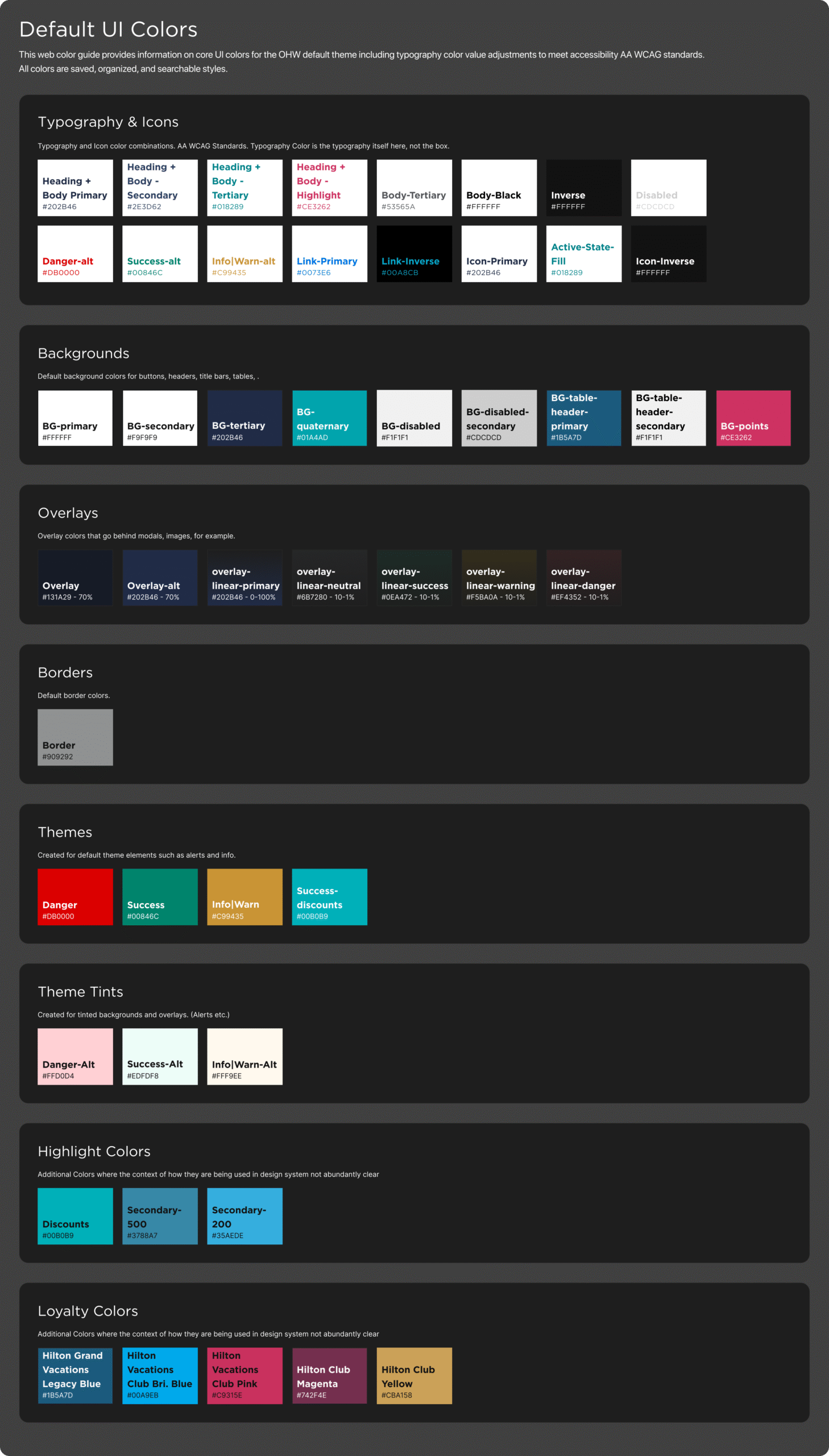
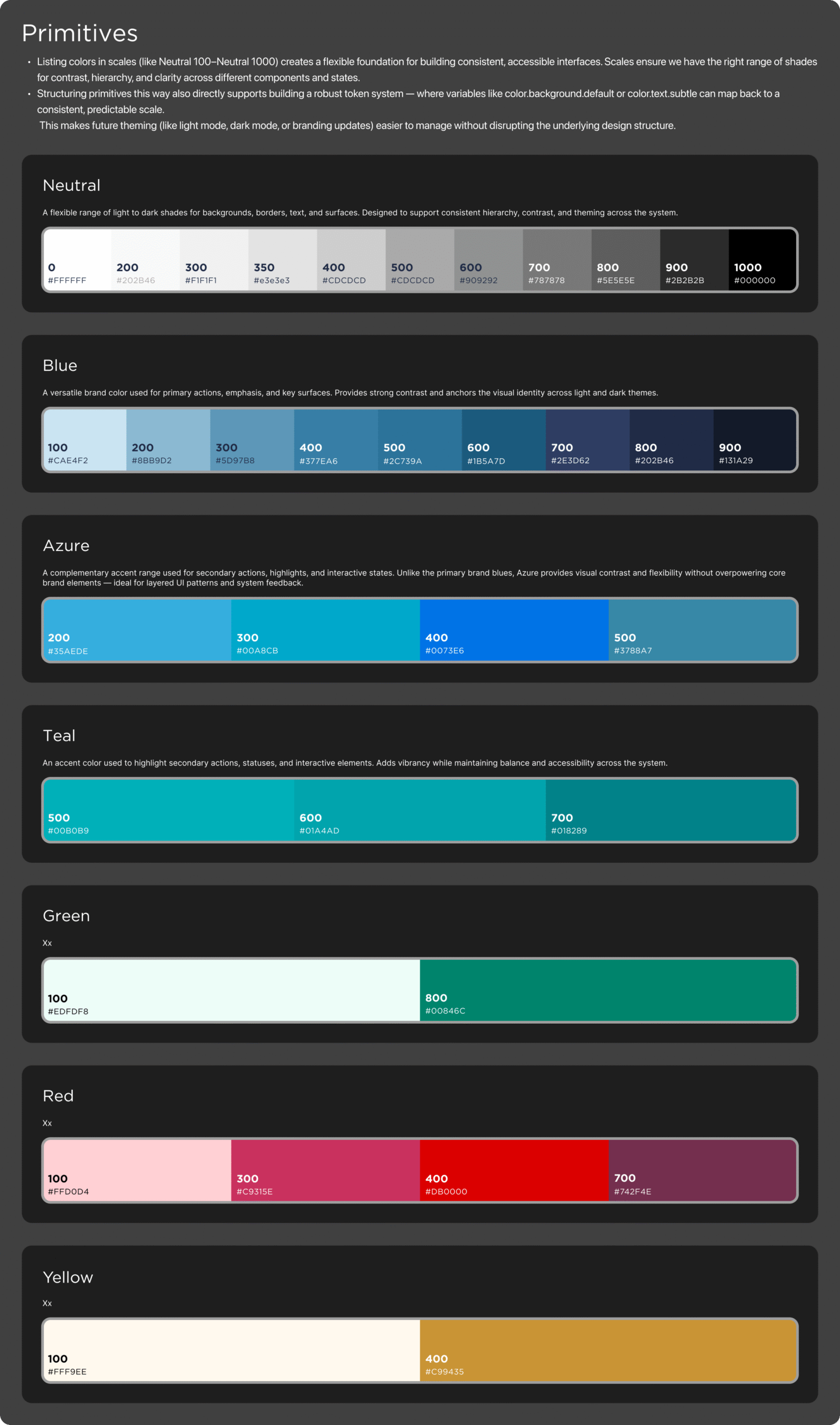
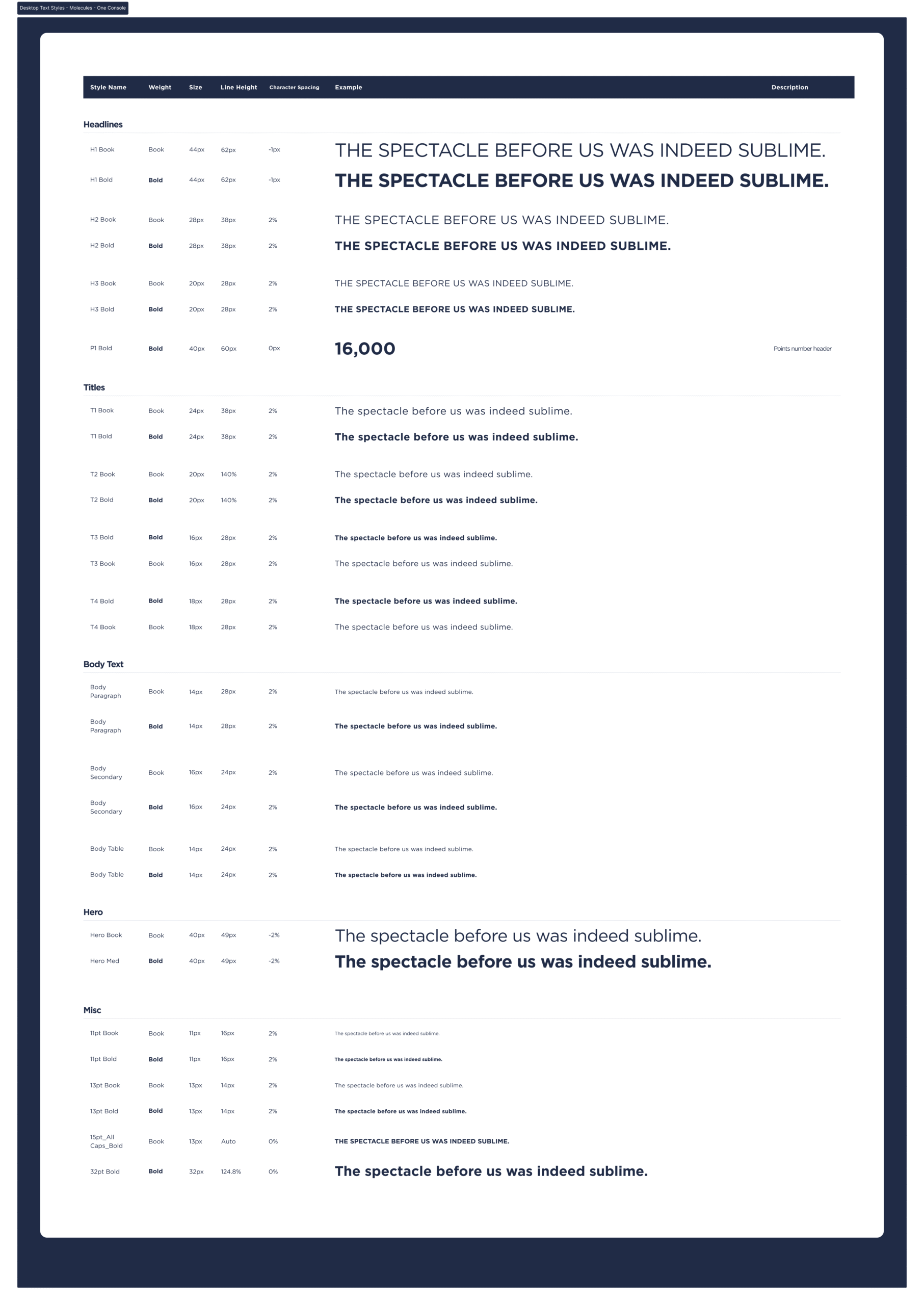
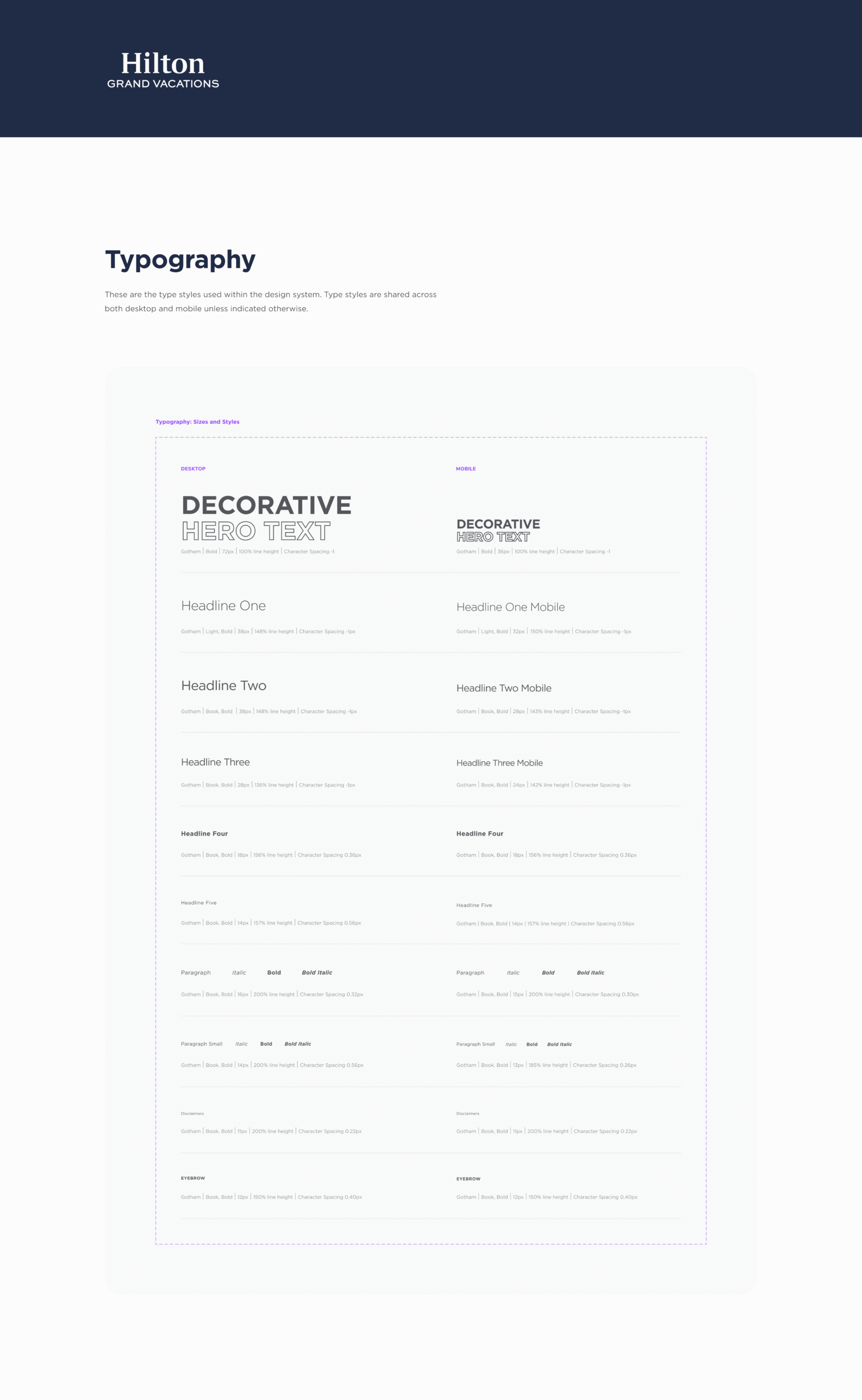
By consolidating Hilton Grand Vacations’ internal design system with a internal vendor who was using their own, I implemented a unified, semantically named toolkit for colors, components, and typography, for usage across marketing and product design teams.
Target and Challenge
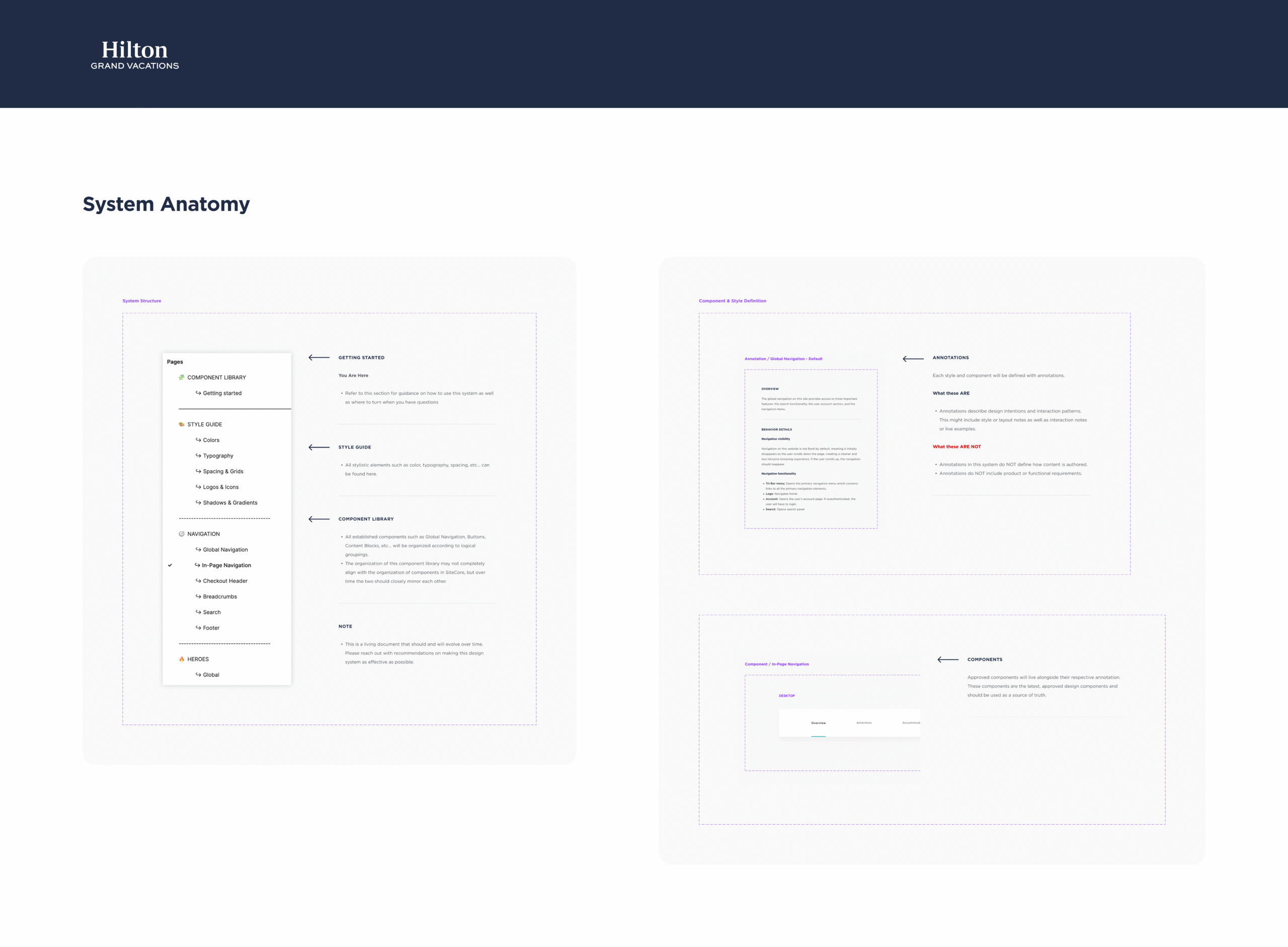
A main challenge was that Hilton Grand Vacations had tons of existing work that were following a set of guidelines of usage of components, colors, typography, and other elements that were in a lead designer’s head, but were not organized in a design system that was easy for individual contributors, especially those new to the team, to understand.
I worked towards aligning politically diverse stakeholders, from marketing executives, branding and creative, UX leadership, and external vendors.
I joined during the time of a fast-growing Product Team at Hilton Grand Vacations, which had outdated software development lifecycles in years past, so designing and maintaining a living design system for such was no small problem to solve.
Problems solved
As I was coming in, Hilton Grand Vacations faced the following issues, to highlight a few:
-
Fragmented, siloed design libraries
Before: Multiple teams (internal vs. Bounteous) maintained separate component sets, leading to duplication of effort and inconsistent UIs.
Solved by: Merging libraries into one source of truth so every team pulls from the same components. -
Primitive, non‑semantic naming conventions for colors and typography
Before: Colors were named generically (e.g., “Blue 400”, “Primary Dark”) causing misapplication and visual mismatches across screens.
Solved by: Defining a semantic token layer (e.g., “Button-Primary”, “Feedback-Success”) atop primitives, which reduced errors and ensured correct usage. -
Inconsistent design-to-development handoffs
Before: Without shared naming or clear documentation and annotation, handoffs often required extra back‑and‑forth to clarify which component or style to implement from design to development to QA.
Solved by: Standardizing Figma components with semantic names and writing concise usage guidelines, reducing clarifications and speeding up dev implementation.
Outcomes and Achievements
Treating the design system as a product itself
-
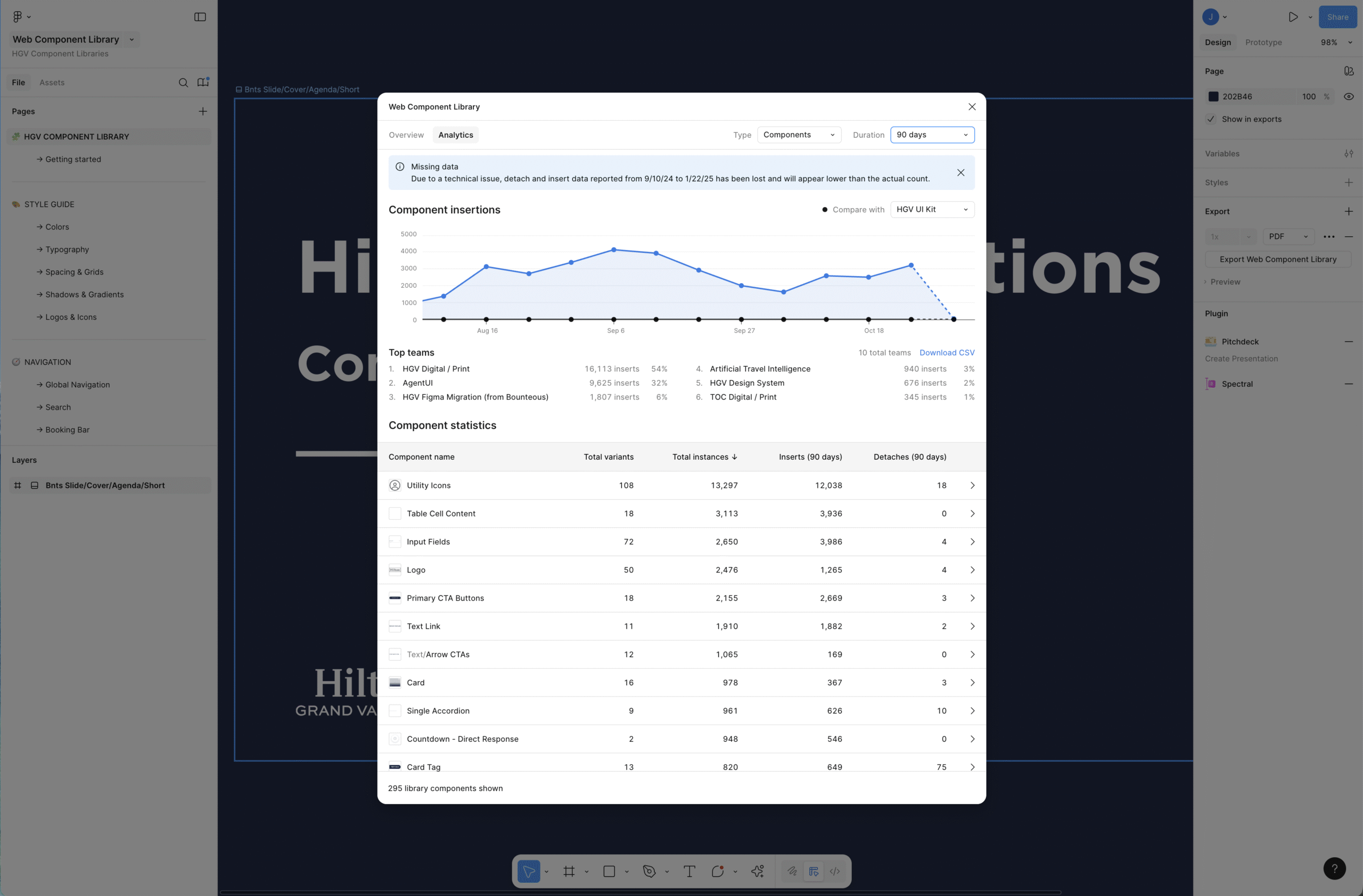
Consolidated previously siloed design libraries into a single cohesive Design System, reducing duplication, eliminating version drift, and ensuring every team draws from the same source of truth.
-
Secured organization-wide adoption across all digital touchpoints—from Mobile Apps, Consumer Web Apps, Marketing Sites, to internal tools—so that every interface reflects a consistent brand experience.
-
Built the foundation for future scalability, in the realms of reducing time to market, reducing UI rework, and faster onboarding for newly hired designers.
The Product
Technologies used
Figma: including components, tokens, variables and styles, using Figma’s version control, Figma’s Branching, and StoryBook
Offices Coordinating
Orlando, FL.
Boca Raton, FL.
ERIE, PA.
Teams Worked with
Product Design, Marketing, Branding & Creative, Executive Leadership
Responsibilities
I worked on this project as a leading Product Designer alongside one other leading Product Designer.
As time went on, more Product Designers would assist with design system tasks.
We communicated remotely using Microsoft Teams calls, chat, and Figma comments to work together, simultaneously.
– Design Systems Consolidation
– Design System Component Creation
– Accessibility, following WCAG Conformance

